The client approached us with a requirement to design a responsive version of the mobile site for an existing website. The main objective was to make the website compatible and visually appealing on mobile browsers across iPhone, iPad, and Android devices. The client’s focus was on providing users with an easy and smooth browsing experience on smaller screens without losing the original design essence. The website was meant to display detailed information about yacht equipment, making it easier for visitors to access relevant details on the go. The client also emphasized maintaining consistency with the existing desktop layout while optimizing for mobile speed and usability.
We began by analyzing the existing desktop website to understand its structure, visual layout, and key content elements. Our team focused on maintaining design consistency while adjusting layouts to fit multiple screen sizes effectively. Responsive design principles were applied carefully to make the browsing experience smoother on mobile devices.
After the initial analysis, we developed the responsive layouts using HTML and CSS, optimizing each page for better display on iPhone, iPad, and Android browsers. This step involved testing across devices to confirm that the pages adjusted properly without design distortion or content overlap.
We conducted detailed research on websites related to yacht equipment to understand user preferences and design standards in that segment. This helped us create a layout that feels intuitive for users and showcases the products in an organized way. Our research also guided us in structuring navigation that allows easy movement across different sections of the website.
Once the layout and navigation were finalized, we worked on refining the interface elements such as menus, buttons, and content alignment. Each feature was designed keeping usability in focus, allowing visitors to quickly find the information they need about yacht equipment without extra scrolling or confusion.
Performance optimization was another important part of our process. We reduced image sizes, improved loading speed, and tested all interactive elements to confirm smooth functionality. These efforts helped in maintaining both aesthetics and performance consistency across mobile browsers.
Finally, after thorough testing and refinements, we delivered the complete mobile version of the website. The client appreciated the design updates and was pleased to see how well the site performed on different mobile devices. The project outcome reflected our detailed approach to mobile responsiveness and content accessibility.
Microsoft Dot Net, Design HTML & CSS, jQuery

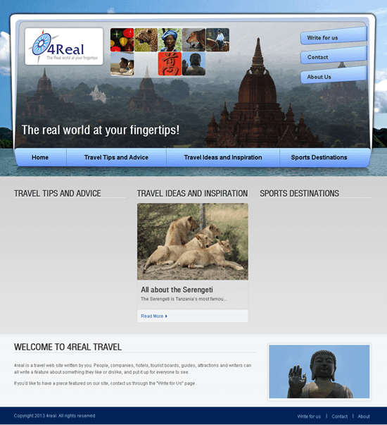
WordPress Based Travel Website - 4Real
View Details
Travel Website in PHP for Online Hotels & Resorts Booking
View Details
Travel Website in PHP for 'Bowling Centers' - Hospitality Service
View Details
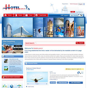
Travel Website in PHP for Hotels & Tourism Company
View Details
