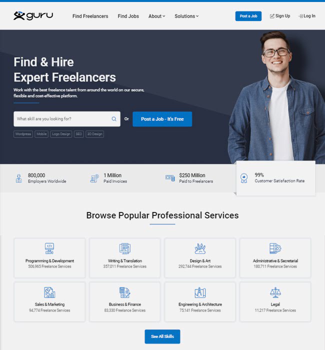
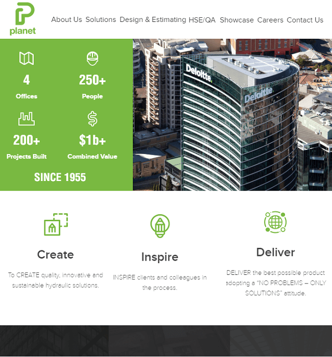
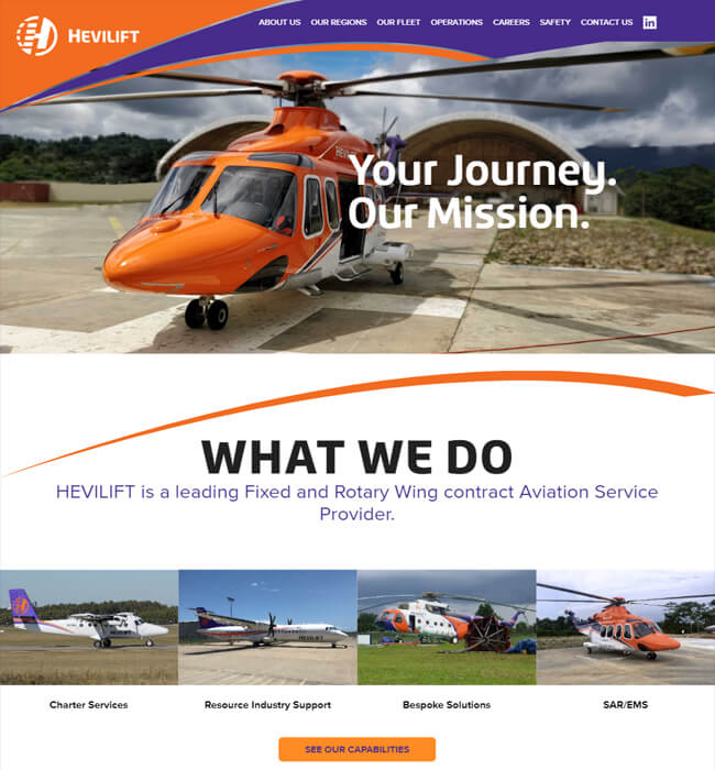
The client approached us with the requirement of making their existing website adaptable to different device screens. The website was functional but lacked responsiveness, making it difficult for users to access and navigate smoothly across different platforms. The client wanted the same design and content structure to remain intact but needed it to display correctly on smartphones, tablets, laptops, and desktops. The goal was to modernize the code without changing the look and feel of the site. They requested our assistance in recoding the layout to achieve a consistent viewing experience for all users.
The client’s website was originally created using a table-based layout, which limited its adaptability on modern devices. To address this, our team started by restructuring the entire HTML code from scratch. We chose to work with the Zurb Framework, which helped us rebuild the site with responsive capabilities while maintaining the existing design elements.
We carefully planned the coding structure so that each component would automatically adjust to fit different screen sizes. Using HTML5 and CSS3, our team defined flexible grid layouts and fluid elements that worked well across all devices. This approach allowed the website to resize and reorganize its content naturally, making it comfortable to browse on any screen.
During the process, we paid close attention to the visual hierarchy and spacing. Each section of the website was adjusted to maintain readability and proper alignment. This made the interface look consistent whether it was accessed on a small mobile display or a wide desktop monitor.
We also tested the website on multiple browsers and devices to check compatibility and responsiveness. Our goal was to make sure the site functioned smoothly without breaking the design or affecting loading speed. Any layout inconsistencies found during testing were corrected immediately to maintain uniformity.
The use of the Zurb Framework gave us the flexibility to apply modern design principles without altering the client’s original concept. The final result was a fully responsive website that adapted well to every screen size. It retained the same content and appearance but offered a more user-friendly experience across all devices.
Through this approach, the website achieved better accessibility and usability. The client was satisfied with the outcome as the new layout maintained their original design identity while functioning effectively on smartphones, tablets, laptops, and desktops.

Brand Identity Revamp Web Design (13647)- Portfolio work
View Details
UX Web Designing for a Freelancer Job Portal - Guru
View Details
Website Redesign for Plumbing Industry in Australia - PlanetPlumbing
View Details
WordPress Website Designing for Aviation Industry in Australia - Hevilift
View Details
